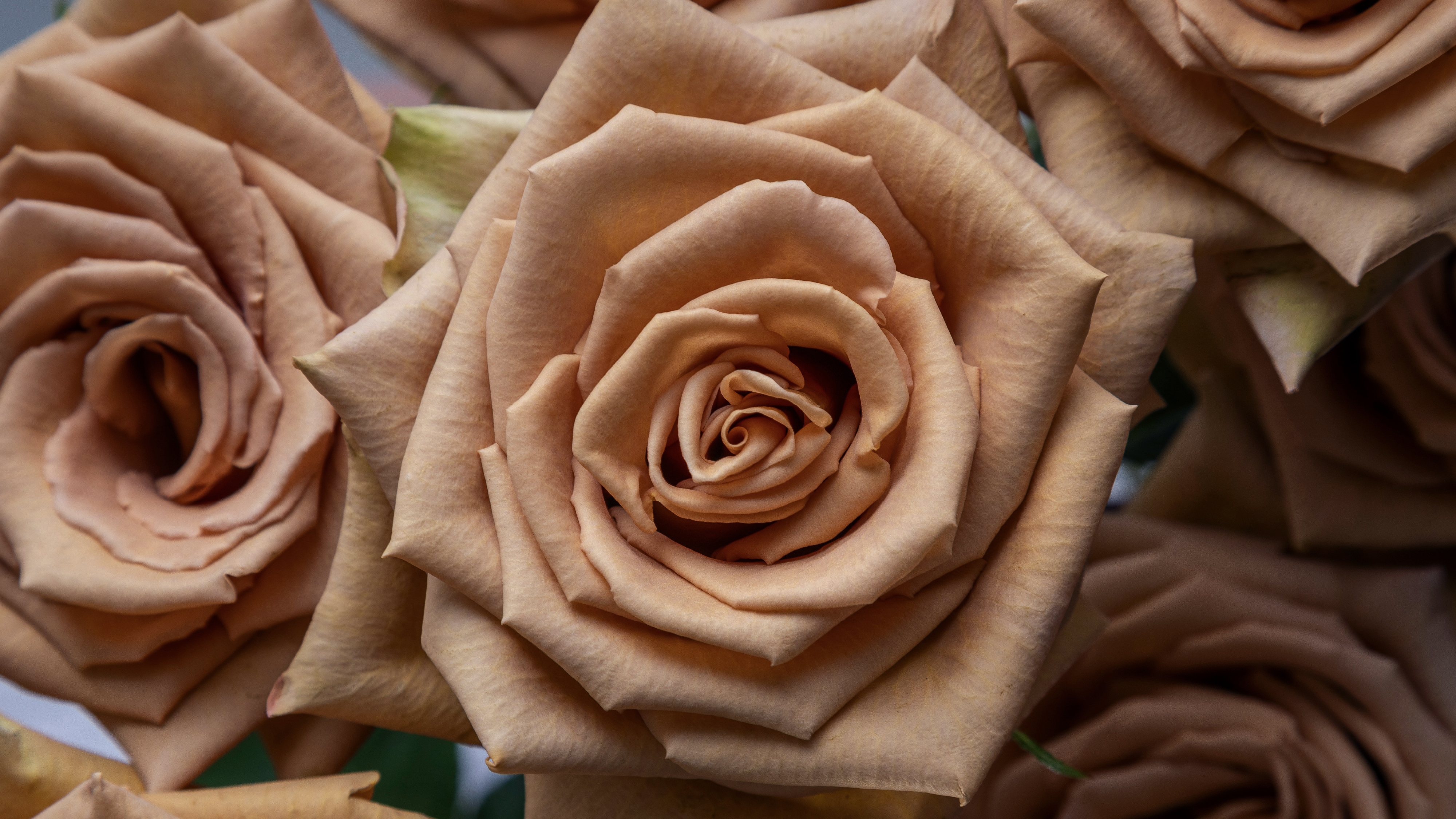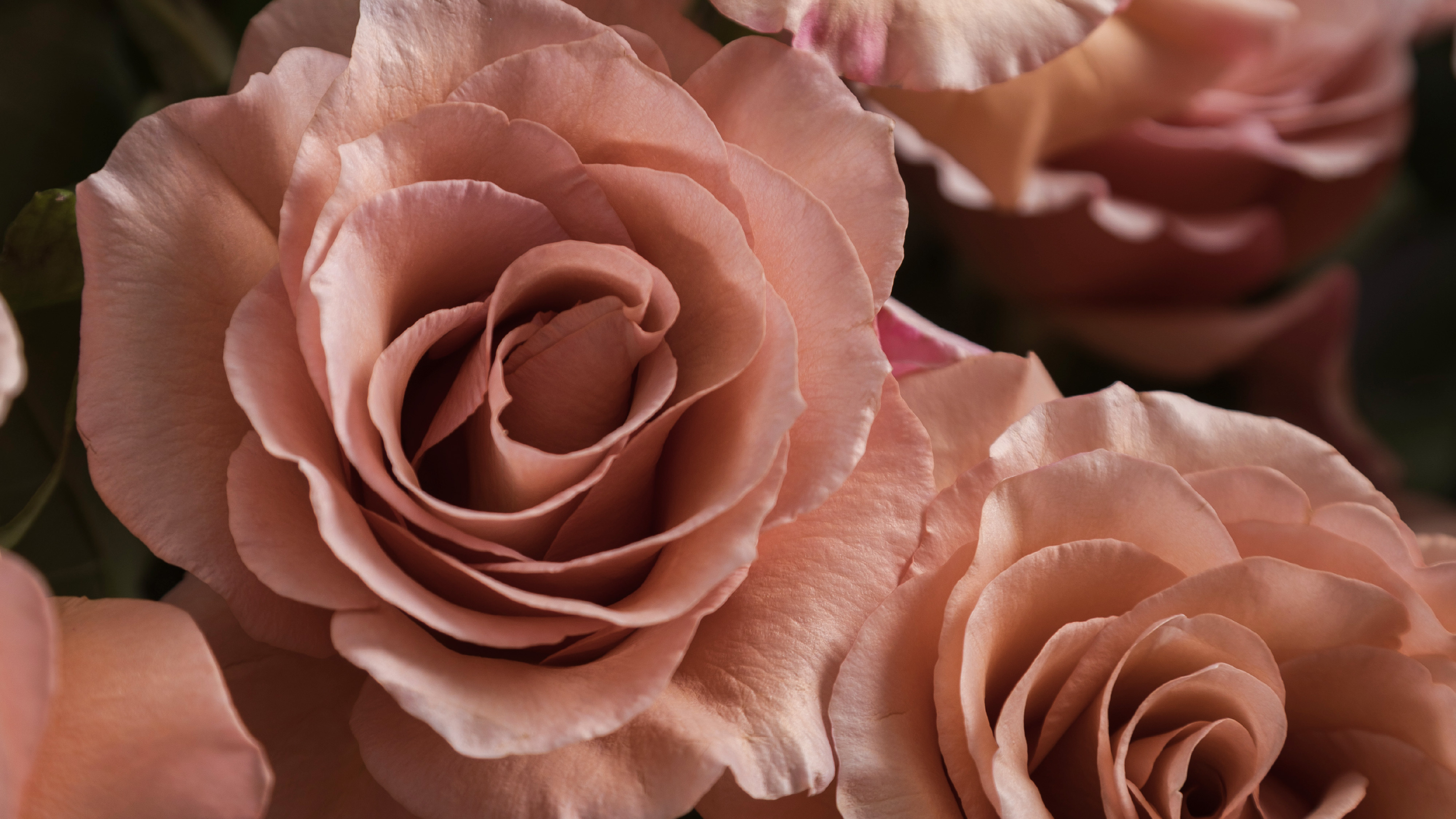
Before every arrangement takes shape, decisions are made about what belongs together.
Which rose establishes the starting point? Which flower brings something different? Where should the composition find balance, and where can contrast add character?
These decisions are part of what makes a floral design feel intentional.
This fall, Rosaprima and Floraprima explore contrast through thoughtful pairings: a rose beside a flower that changes its presence. A deeper tone beside something warmer. A structured form alongside something more open. A layered texture next to a finer one.
The flowers alone don’t define the possibilities. The relationship between them does.
A Different Way to Look at Color
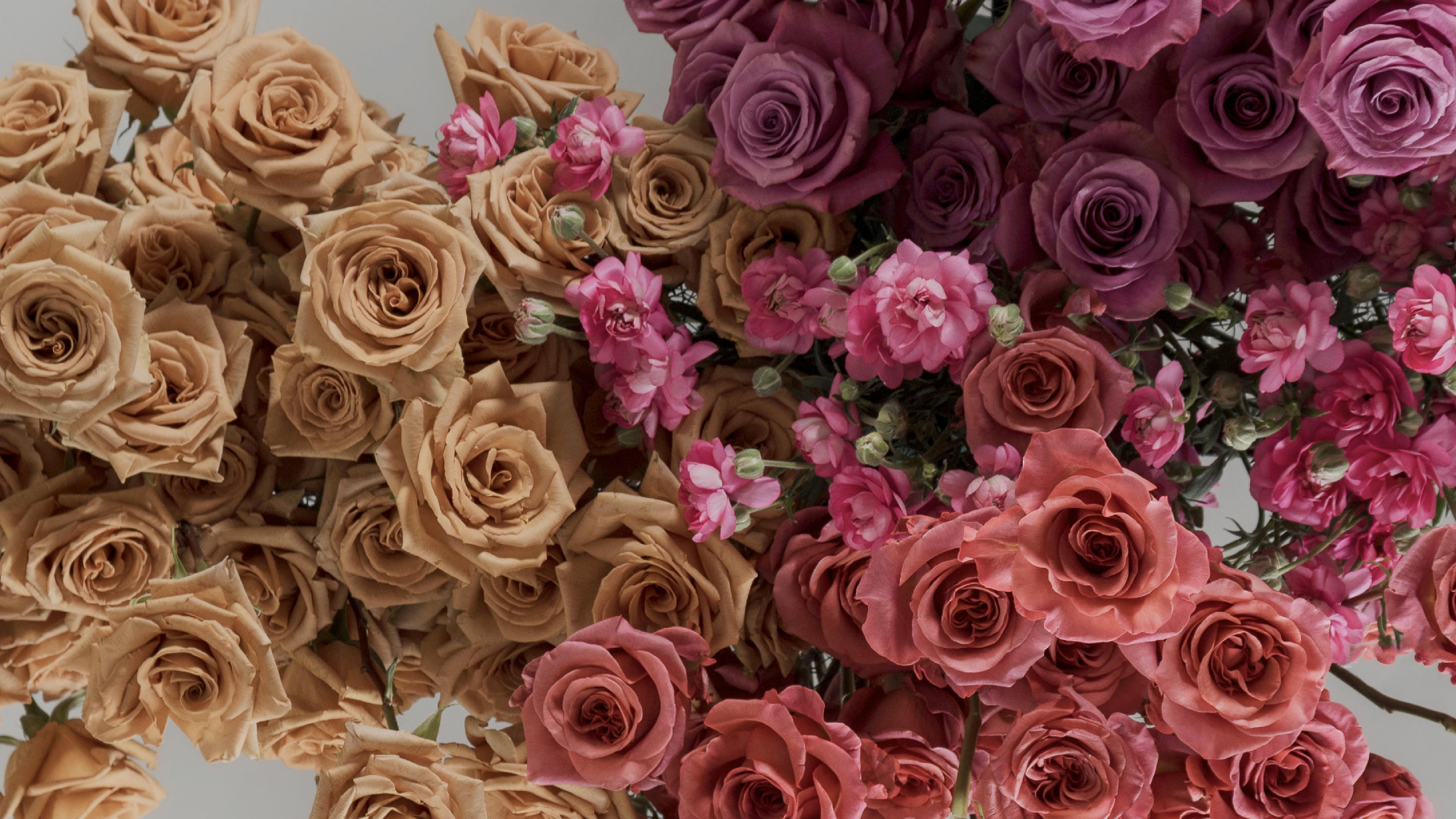
Some pairings become interesting precisely because the colors bring something different to the composition.
RP Espresso and Mistral Burgundy establish depth, creating a foundation for warmer tones to emerge. Fibonacci Aureus and Poppy Arancio shift the composition toward greater warmth and brightness.
The combination works not simply because the colors belong to the same season. It’s how each changes the others’ presence through contrast.
A Different Way to Look at Form
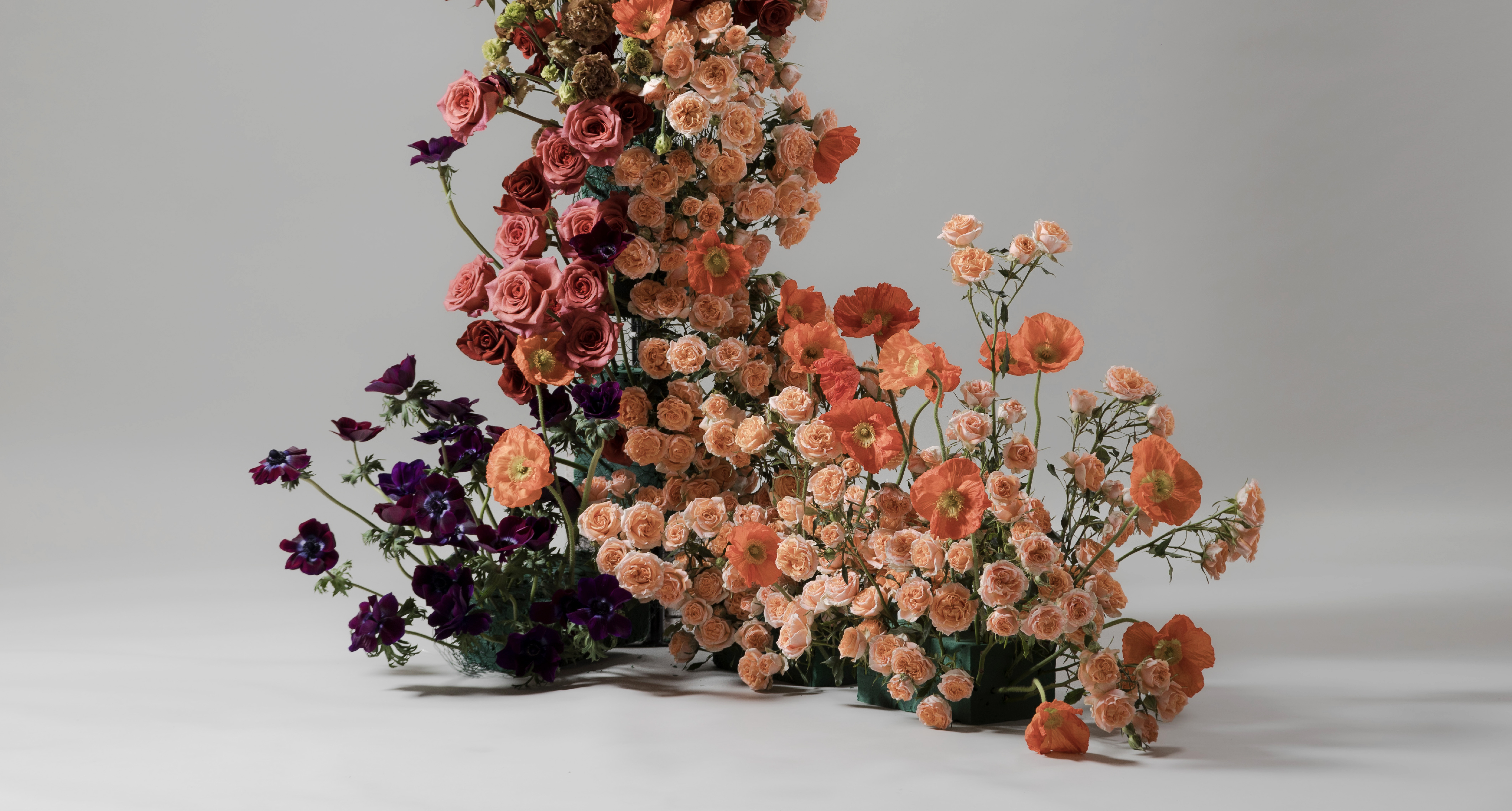
Form brings another dimension to the relationship between elements.
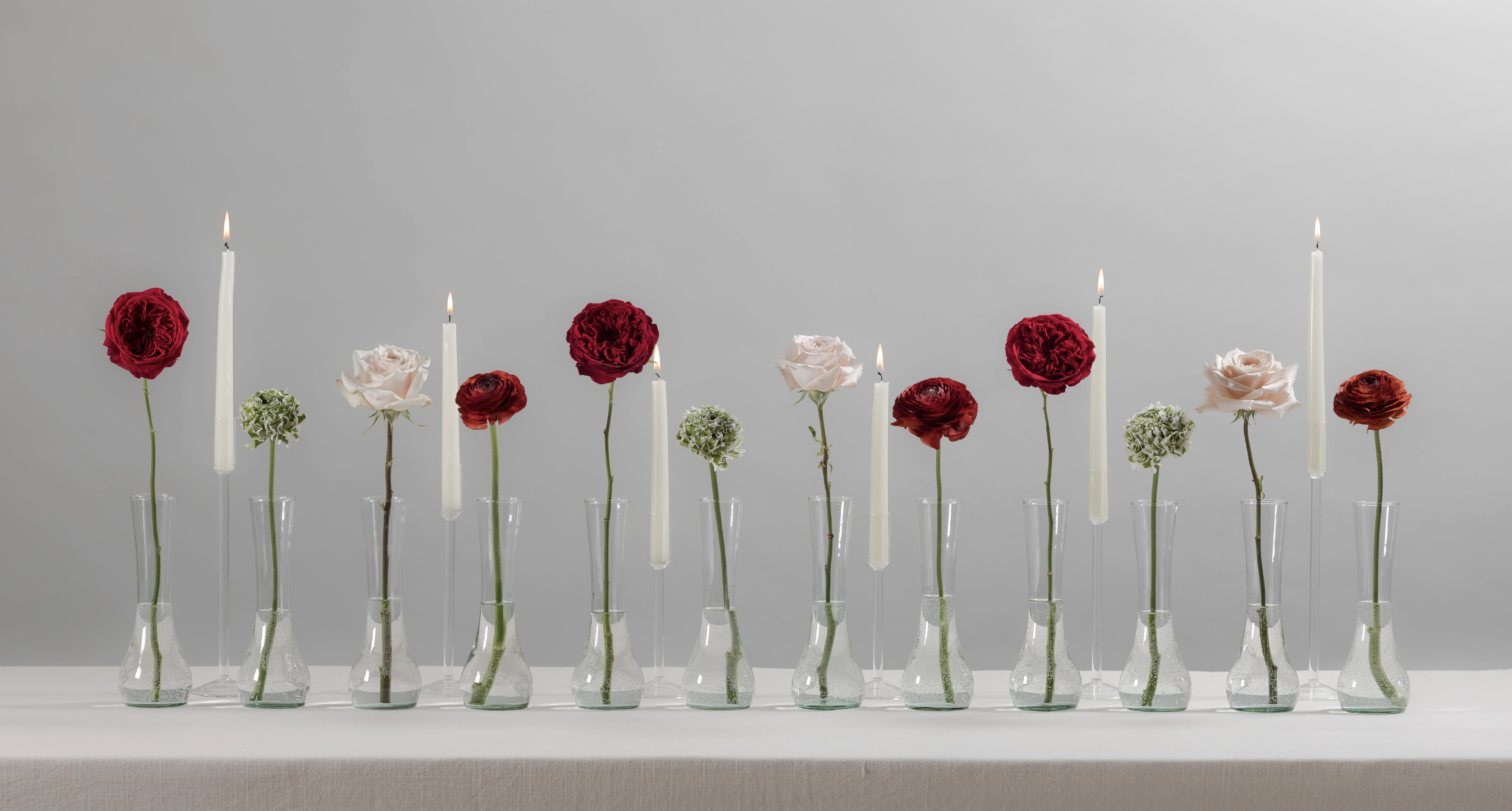
Tess, Elegance Cioccolato, Pon Pon White, and Quicksand create one relationship between shape, scale, and placement. RP Moab, Tess, and Elegance Cioccolato create another.
The varieties retain their individual forms, while their placement gives those forms a different role within the composition.
That is where selection becomes important. Choosing a flower is only the first decision. Choosing what it sits beside gives that choice meaning.
A Different Way to Look at Texture
Texture introduces another kind of distinction, one that becomes apparent as the eye moves through a composition.
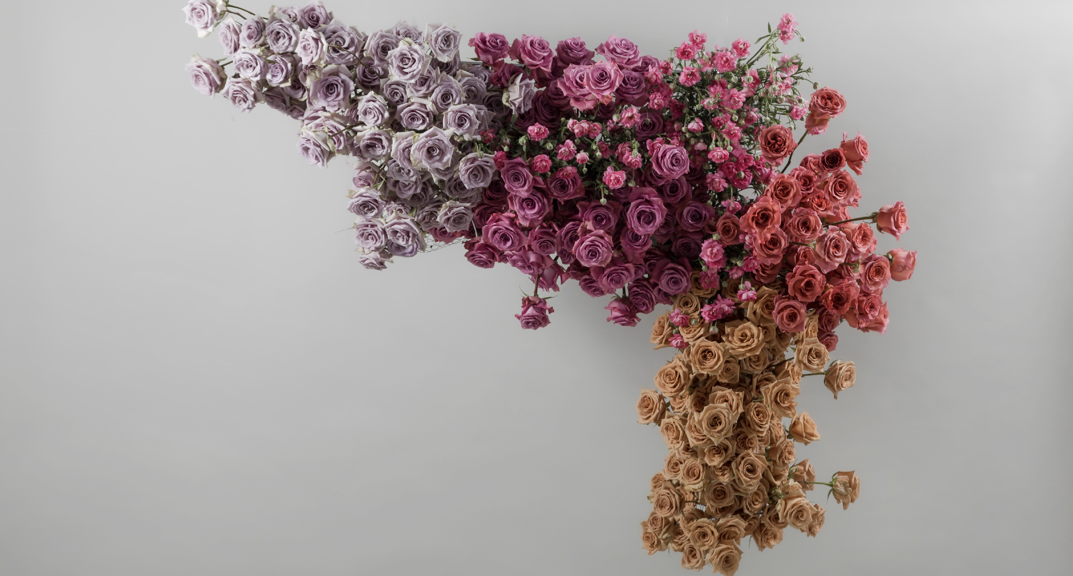
Moon River and Razzmatazz add layers of texture, while Shocking Blue, Moderna Dolce, and Toffee introduce variation in surface, density, and movement.
These differences create depth and dimension, giving the gaze places to pause, move, and discover.
The Value of the Second Element
A rose can anchor a composition while another flower expands its possibilities.
This is where the relationship between Rosaprima and Floraprima matters most. Rosaprima roses provide the foundation, while Floraprima flowers add distinction. Together, they give designers room to explore contrast through color, form, and texture.
For Rosaprima, this reflects a larger approach to selection: offering varieties with enough distinction to give designers room to choose. It means looking beyond a flower’s individual quality and considering the possibilities it creates alongside others.
A variety becomes even more valuable when it opens up new design possibilities through contrast.
Sometimes, it is the element that brings just enough difference to change everything around it.